Getting Started with Bryntum Grid in React
Try React demos
Bryntum Grid is delivered with a variety of React demo applications showing its functionality. All demo applications have been verified to be compatible with Node.js 20.
Version requirements
Minimum supported:
- React:
16.0.0or higher - TypeScript:
3.6.0or higher (for TypeScript application) - Vite
4.0.0or higher (for application build with Vite)
Recommended:
- React:
18.0.0or higher - TypeScript:
4.0.0or higher (for TypeScript application) - Vite
5.0.0or higher (for application build with Vite)
Get Started
In this guide we will explain how to get started if you are using vitejs.org guide.
To get started, the broad steps are as follows:
- Access to npm registry
- Create Application
- Install components
- Add components to Application
- Apply styles
- Run the application
The application we are about to build together is pretty simple, and will look like the illustration below:
Access to npm registry
Bryntum components are commercial products, hosted in a private Bryntum repository. Please refer to this guide for Bryntum NPM repository access.
Create Application
There are many possible ways of creating and building React applications. Let’s use React Vite guide, which has proven to offer higher efficiency and better performance in development.
If you are using javascript only, please type:
npm create vite@latest bryntum-grid-app -- --template react
or if you prefer using typescript:
npm create vite@latest bryntum-grid-app -- --template react-ts
Please feel free to change bryntum-grid-app to your preferred application name.
Once the template is created, install the node modules:
cd bryntum-grid-app
npm install && npm install sass
Install components
From your terminal, update project dependencies using the following commands:
npm install @bryntum/grid@npm:@bryntum/[email protected] @bryntum/[email protected]
Ensure that you have configured your npm properly to get access to the Bryntum packages. If not, refer to this guide.
Dependencies
The application configuration may add a caret ^ as a prefix of dependencies version. We recommend not to use the caret
character as a version prefix to take upgrades fully under control. If necessary, please check the generated
package.json file and replace dependencies and devDependencies by the following:
"dependencies": {
  "@bryntum/grid": "npm:@bryntum/[email protected]",
  "@bryntum/grid-react": "7.2.0-alpha-1",
  "react": "18.2.0",
  "react-dom": "18.2.0"
},
"devDependencies": {
  "@types/react": "~18.2.14",
  "@types/react-dom": "~18.2.6",
  "@vitejs/plugin-react": "~4.0.1",
  "postinstall": "~0.7.4",
  "sass": "~1.69.6",
  "typescript": "~5.1.6",
  "vite": "~4.4.5"
}
Note: The version of React above is not mandatory and is used here only for the purpose of the example. Please adjust the dependencies according to your development requirement.
Vite Configuration
When using Vite to run a Bryntum application in development mode, in order to fix loading bundles multiple times, it is recommended to include Bryntum packages in the optimizeDeps in vite.config.js. Please follow this guide for more configuration information.
Add components to Application
Now that your project has been setup, let's start with creating a config file in the src, which will have Grid
configuration.
export const gridProps = {
columns : [
{
text : 'Name',
field : 'name',
flex : 1,
editor : {
type : 'textfield',
required : true
}
}, {
text : 'Age',
field : 'age',
width : 100,
type : 'number'
}, {
text : 'City',
field : 'city',
flex : 1
}, {
text : 'Food',
field : 'food',
flex : 1
}, {
text : 'Color',
field : 'color',
width : 80,
type : 'column',
renderer : ({ cellElement, value }) => {
cellElement.style.color = value;
cellElement.style.fontWeight = '700';
return value;
}
}
],
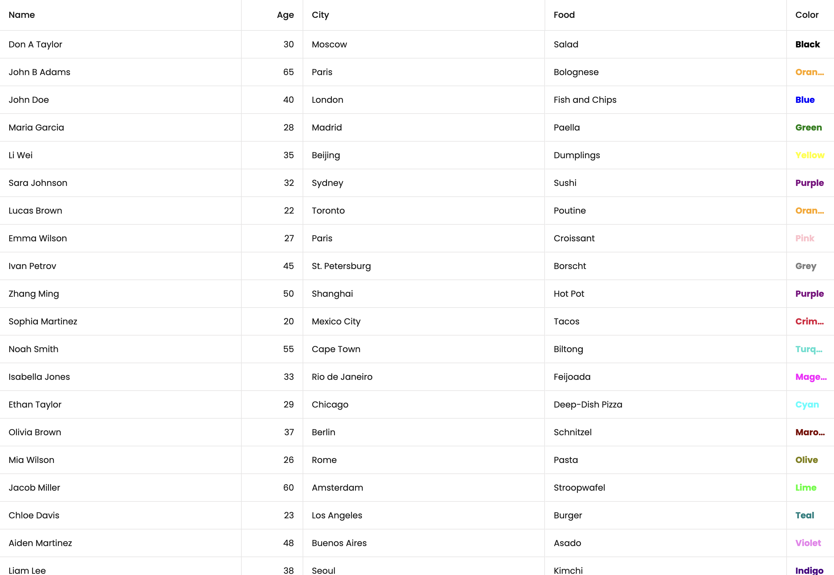
data : [
{ id : 1, name : 'Don A Taylor', age : 30, city : 'Moscow', food : 'Salad', color : 'Black' },
{ id : 2, name : 'John B Adams', age : 65, city : 'Paris', food : 'Bolognese', color : 'Orange' },
{ id : 3, name : 'John Doe', age : 40, city : 'London', food : 'Fish and Chips', color : 'Blue' },
{ id : 4, name : 'Maria Garcia', age : 28, city : 'Madrid', food : 'Paella', color : 'Green' },
{ id : 5, name : 'Li Wei', age : 35, city : 'Beijing', food : 'Dumplings', color : 'Yellow' },
{ id : 6, name : 'Sara Johnson', age : 32, city : 'Sydney', food : 'Sushi', color : 'Purple' },
{ id : 7, name : 'Lucas Brown', age : 22, city : 'Toronto', food : 'Poutine', color : 'Orange' },
{ id : 8, name : 'Emma Wilson', age : 27, city : 'Paris', food : 'Croissant', color : 'Pink' },
{ id : 9, name : 'Ivan Petrov', age : 45, city : 'St. Petersburg', food : 'Borscht', color : 'Grey' },
{ id : 10, name : 'Zhang Ming', age : 50, city : 'Shanghai', food : 'Hot Pot', color : 'Purple' },
{ id : 11, name : 'Sophia Martinez', age : 20, city : 'Mexico City', food : 'Tacos', color : 'Crimson' },
{ id : 12, name : 'Noah Smith', age : 55, city : 'Cape Town', food : 'Biltong', color : 'Turquoise' },
{ id : 13, name : 'Isabella Jones', age : 33, city : 'Rio de Janeiro', food : 'Feijoada', color : 'Magenta' },
{ id : 14, name : 'Ethan Taylor', age : 29, city : 'Chicago', food : 'Deep-Dish Pizza', color : 'Cyan' },
{ id : 15, name : 'Olivia Brown', age : 37, city : 'Berlin', food : 'Schnitzel', color : 'Maroon' },
{ id : 16, name : 'Mia Wilson', age : 26, city : 'Rome', food : 'Pasta', color : 'Olive' },
{ id : 17, name : 'Jacob Miller', age : 60, city : 'Amsterdam', food : 'Stroopwafel', color : 'Lime' },
{ id : 18, name : 'Chloe Davis', age : 23, city : 'Los Angeles', food : 'Burger', color : 'Teal' },
{ id : 19, name : 'Aiden Martinez', age : 48, city : 'Buenos Aires', food : 'Asado', color : 'Violet' },
{ id : 20, name : 'Liam Lee', age : 38, city : 'Seoul', food : 'Kimchi', color : 'Indigo' },
{ id : 21, name : 'Sophie Kim', age : 21, city : 'Tokyo', food : 'Ramen', color : 'Pink' },
{ id : 22, name : 'Alexander Nguyen', age : 41, city : 'Hanoi', food : 'Pho', color : 'Coral' },
{ id : 23, name : 'Ella Patel', age : 19, city : 'Mumbai', food : 'Curry', color : 'Amber' },
{ id : 24, name : 'James O Connor', age : 34, city : 'Dublin', food : 'Irish Stew', color : 'Green' },
{ id : 25, name : 'Isabelle Chen', age : 31, city : 'Hong Kong', food : 'Dim Sum', color : 'Brown' }
]
};
Next is to replace your App.jsx or App.tsx with the following code:
import { BryntumGrid } from '@bryntum/grid-react';
import { gridProps } from './GridConfig';
import './App.scss';

function App() {

    return (
        <BryntumGrid
            {...gridProps}
        />
    );
}

export default App;
This will setup your Grid, but you need to apply some styling to it.
Apply styles
Including a theme + structural CSS is required to render the Bryntum Grid correctly, and if you are not replacing the icons used by the component, you will also need to include Font Awesome.
The following CSS files are provided with the Bryntum npm packages or in the /build folder of the distribution:
| File | Contents |
|---|---|
grid.css | Structural CSS |
svalbard-light.css | Svalbard Light theme |
svalbard-dark.css | Svalbard Dark theme |
visby-light.css | Visby Light theme |
visby-dark.css | Visby Dark theme |
stockholm-light.css | Stockholm Light theme |
stockholm-dark.css | Stockholm Dark theme |
material3-light.css | Material3 Light theme |
material3-dark.css | Material3 Dark theme |
fluent2-light.css | Fluent2 Light theme |
fluent2-dark.css | Fluent2 Dark theme |
fontawesome/css/fontawesome.css | Font Awesome Free base CSS |
fontawesome/css/solid.css | Font Awesome Free solid icons |
To ensure there is no unexpected styling, delete the index.css file and also remove it from the main.jsx or main.tsx.
Next, rename the App.css file to App.scss and replace it with the following:
// FontAwesome is used for icons
@import "@bryntum/grid/fontawesome/css/fontawesome.css";
@import "@bryntum/grid/fontawesome/css/solid.css";
// Import grid's structural CSS
@import "@bryntum/grid/grid.css";
// Import your preferred Bryntum theme
@import "@bryntum/grid/svalbard-light.css";

// Giving our grid some height
#root {
  height: 100vh;
}
Visit Creating a custom theme section for more info on how to create a custom theme.
You can learn more about styling your Bryntum Grid in our style guide.
Run the application
Run application development server:
npm run dev
Your application is now available under http://localhost:5173 in your browser.
Happy coding!
Troubleshooting
Please refer to this Troubleshooting guide.
What to do next?
Further on integration with React
Do you want to know more about how Bryntum Grid integrates with react and start to customize your application? We provide you with a complete React guide here.
Learn about Data
Bryntum components often use multiple collections and entities.
The Data guide explains how they all fit together.