Replacing the Cell menu and the Header menu
Bryntum Grid ships with built-in context menus for grid cells and for grid column headers. Depending on your needs, you might either want to customize them (see the "Customize context menus" guide) or replace them entirely. This guide shows how to replace them with a custom implementation using Bootstrap, but the general principles should apply whichever framework you are using.
The result of this guide can be seen in the custom-contextmenu demo.
Step 1 - Create a custom context menu
How this is done will vary greatly depending on which UI framework etc. you are using. For the purpose of this guide, we
are using Bootstrap 4. With Bootstrap the context menu is defined in HTML on the page, using dropdown-menu
which we will display when needed. Here is an example of the menus used in the demo, added to index.html:
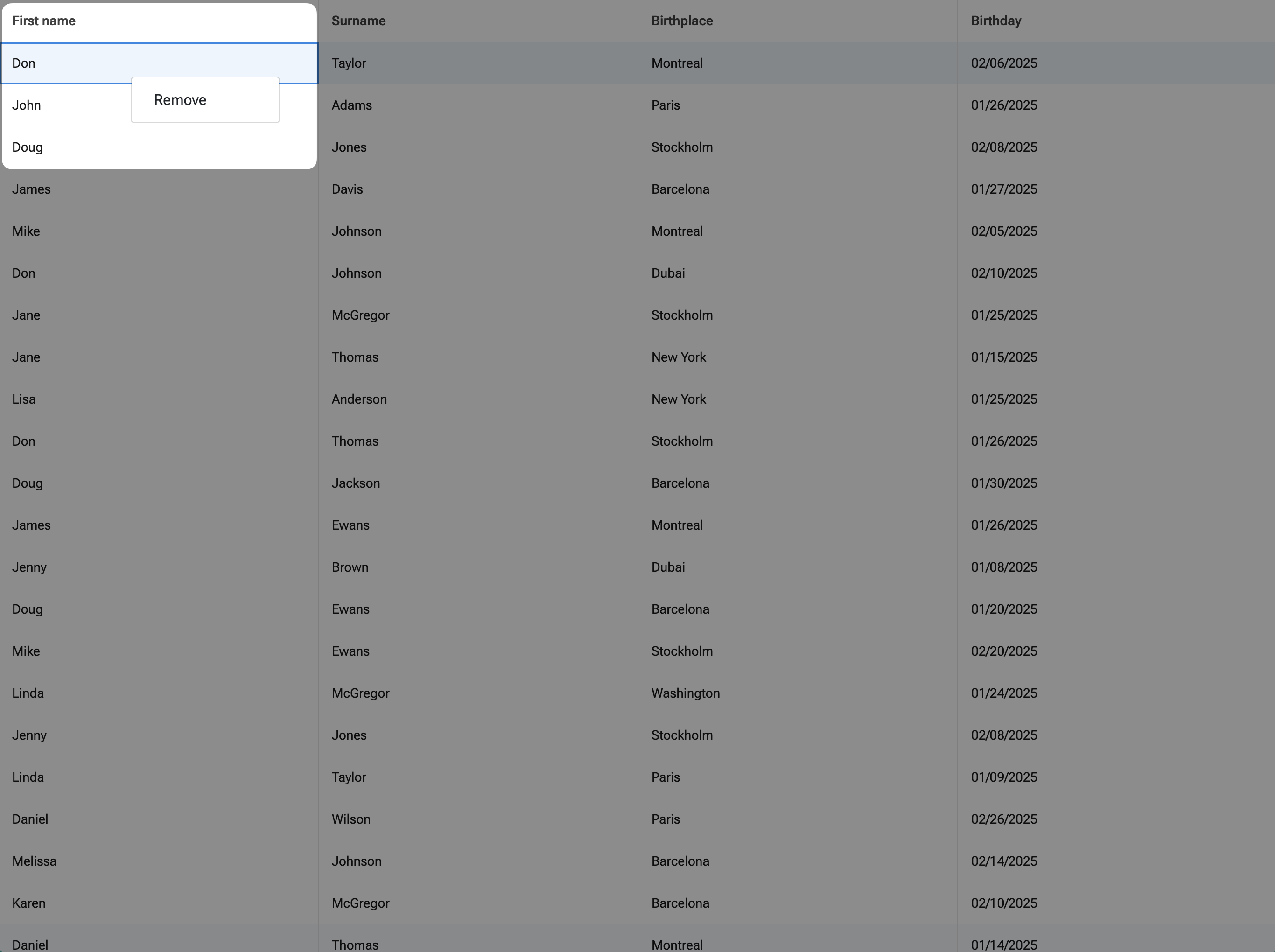
<div id="customCellMenu" class="dropdown-menu">
<button class="dropdown-item" type="button" data-ref="remove">Remove</button>
</div>
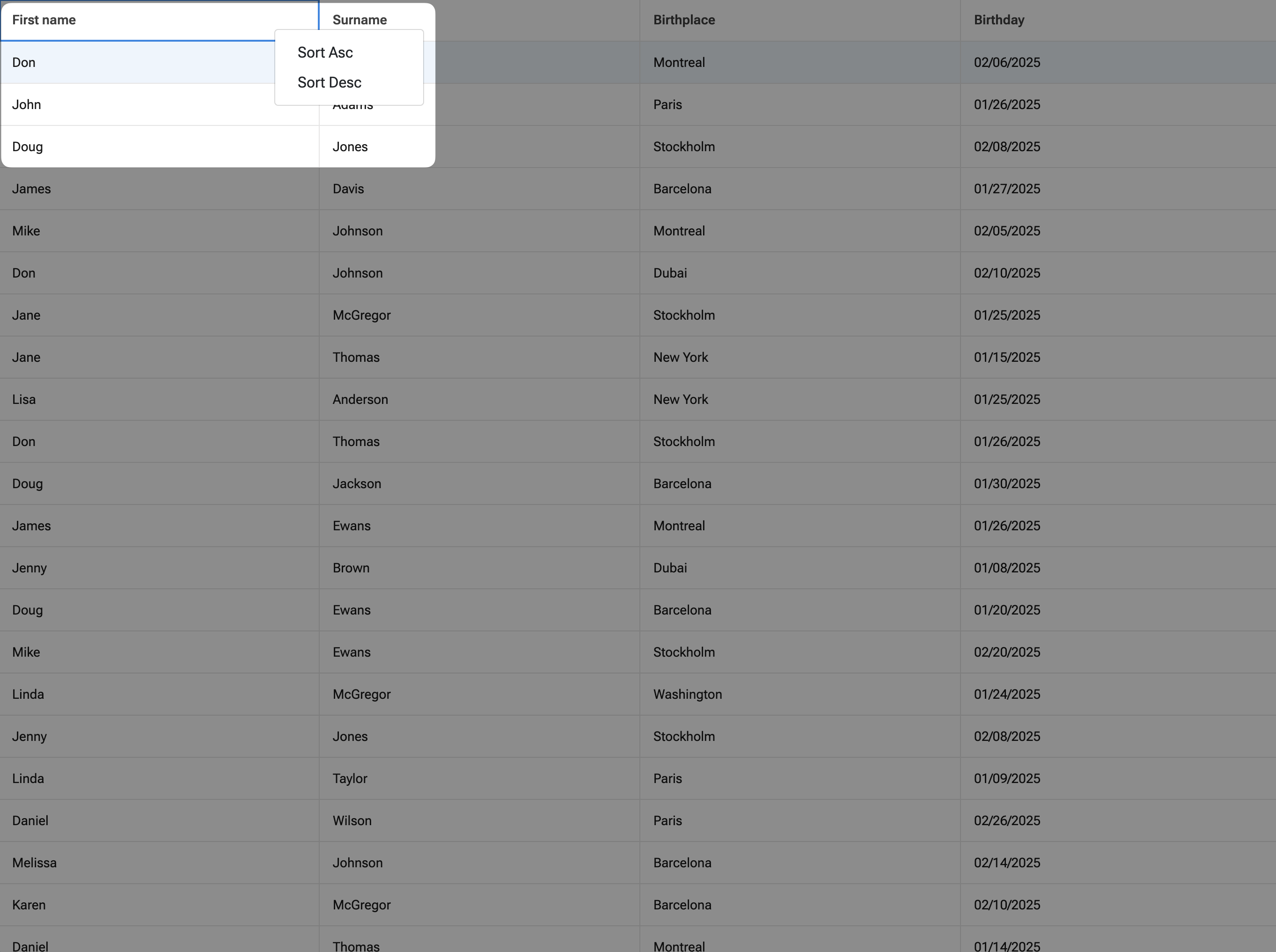
<div id="customHeaderMenu" class="dropdown-menu">
<button class="dropdown-item" type="button" data-ref="sortAsc">Sort Asc</button>
<button class="dropdown-item" type="button" data-ref="sortDesc">Sort Desc</button>
</div>
Step 2 - Show and hide the custom menu
The easiest way to show a custom menu is to leave the built-in CellMenu and HeaderMenu features enabled,
listen for when it is about to be shown, prevent that and show your own instead. Using this approach,
you will get all data related to the context menu.
const grid = new Grid({
    listeners : {
        cellMenuBeforeShow() {
            // Show custom cell menu here
            // ...

            // Prevent built-in cell menu
            return false;
        },

        headerMenuBeforeShow() {
            // Show custom header menu here
            // ...

            // Prevent built-in header menu
            return false;
        }
    }
})
Also, since we have 2 different custom context menus, need to make sure there is no other context menu visible at the same time. To show the Bootstrap cell and header menus and hide the other one:
cellMenuBeforeShow({ record, column, event }) {
    // Hide all visible context menus
    $('.dropdown-menu:visible').hide();

    // Set position, and show custom cell menu
    $('#customCellMenu').css({ top : event.y, left : event.x }).show();

    // Prevent built-in cell menu
    return false;
},

headerMenuBeforeShow({ column, event }) {
    // Hide all visible context menus
    $('.dropdown-menu:visible').hide();

    // Set position, and show custom header menu
    $('#customHeaderMenu').css({ top : event.y, left : event.x }).show();

    // Prevent built-in header menu
    return false;
}
To hide custom Bootstrap menus:
// Hide all visible context menus by global click
$(document).on('click', () => {
    $('.dropdown-menu:visible').hide();
});
Step 3 - Link data to the custom context menu
The listener used above to show the context menu is called with data retrieved from the target element among its arguments.
Depending on the menu it can have different arguments. You can always check out the documentation to see what data is available.
For example, in case of Cell menu you can see record and column among its arguments. In case of Header menu you can see
only column. You can pass the data you need to the custom context menu. How to implement it depends on the UI framework
you are using, for Bootstrap we have to set record id and column field to menu element dataset.
cellMenuBeforeShow({ record, event }) {
    // Hide all visible context menus
    $('.dropdown-menu:visible').hide();

    // Set data, set position, and show custom cell menu
    $('#customCellMenu').data({
        recordId : record.id
    }).css({
        top  : event.y,
        left : event.x
    }).show();

    // Prevent built-in cell menu
    return false;
},

headerMenuBeforeShow({ column, event }) {
    // Hide all visible context menus
    $('.dropdown-menu:visible').hide();

    // Set data, set position, and show custom header menu
    $('#customHeaderMenu').data({
        field : column.field
    }).css({
        top  : event.y,
        left : event.x
    }).show();

    // Prevent built-in header menu
    return false;
}
Step 4 - Process menu item click
When the user clicks on a menu item, you need to catch this and process the action. Depending on requested functionality,
you might have different action implementations. But general workflow is next. You need to extract data from the custom
menu element dataset, recognize what menu item is clicked, and call some Grid API to perform the action.
For our Bootstrap demo, it can look like this:
$('#customCellMenu button').on('click', function () {
    const
        recordId = $(this).parent().data('recordId'),
        ref      = $(this).data('ref');

    switch (ref) {
        // Remove menu item implementation
        case 'remove':
            grid.store.remove(recordId);
            break;
    }
});

$('#customHeaderMenu button').on('click', function () {
    const
        field = $(this).parent().data('field'),
        ref   = $(this).data('ref');

    switch (ref) {
        // Ascending sort menu item implementation
        case 'sortAsc':
            grid.store.sort(field, true);
            break;

        // Descending sort menu item implementation
        case 'sortDesc':
            grid.store.sort(field, false);
            break;
    }
});
And thats it, be sure to check the custom-contextmenu demo out!