Getting started with Bryntum Grid in Next.js
This quick start guide will show you how to build a basic Bryntum Grid in a Next.js TypeScript application using the Next.js getting started guide as a starting point.
You can also take a shortcut and start with our Bryntum Grid Next.js with TypeScript starter template that we will create in this guide.
Requirements
Next.js version 15 requires Node.js 18.18 or higher. Bryntum Grid requires React 16.0.0
or higher and TypeScript 3.6.0 or higher for applications written in TypeScript.
Version requirements
Minimum supported:
- React:
16.0.0or higher - TypeScript:
3.6.0or higher (for TypeScript application) - Vite
4.0.0or higher (for application build with Vite)
Recommended:
- React:
18.0.0or higher - TypeScript:
4.0.0or higher (for TypeScript application) - Vite
5.0.0or higher (for application build with Vite)
Getting started
To get started, we'll follow these steps to create a basic Bryntum Grid Next.js app:
- Setup a Next.js application.
- Install the Bryntum Grid component.
- Create a Bryntum Grid component.
- Run the application.
The basic Bryntum Grid starter template that we'll build will look like this:
Setup a Next.js application
We will use the Next.js getting started guide to create a
Next.js application. Next.js recommends using create-next-app to create a new Next.js app as it sets everything up
for you, automatically. Create a Next.js application by running the following command:
npx create-next-app@latest
You'll see multiple prompts. To follow along with this guide, choose the following options:
What is your project named? bryntum-grid
Would you like to use TypeScript? No / Yes ✔️
Would you like to use ESLint? No / Yes ✔️
Would you like to use Tailwind CSS? No ✔️ / Yes
Would you like to use `src/` directory? No ✔️ / Yes
Would you like to use App Router? (recommended) No / Yes ✔️
Would you like to use Turbopack for `next dev`? No ✔️ / Yes
Would you like to customize the default import alias (@/*)? No ✔️ / Yes
After you've selected your answers for the prompt questions, create-next-app will create a folder with your
project name and install the dependencies.
Change your current working directory to the new Next.js project directory:
cd bryntum-grid
Install the Bryntum Grid component
Installing the Bryntum Grid component using npm is the quickest way to use our products. First, get access to the Bryntum private npm registry by following the guide in our docs.
From your terminal, update project dependencies using the following commands:
npm install @bryntum/grid@npm:@bryntum/[email protected] @bryntum/[email protected]
Ensure that you have configured your npm properly to get access to the Bryntum packages. If not, refer to this guide.
Dependencies
The application configuration may add a caret ^ as a prefix of the dependencies version in your package.json file.
We recommend removing the caret character as a version prefix so that you have full control over package updates.
Create a Bryntum Grid component
Create a config file called gridConfig.ts in the app/ folder. Add the following lines of code to it:
import { BryntumGridProps } from '@bryntum/grid-react';
export const gridProps: BryntumGridProps = {
columns : [
{
text : 'Name',
field : 'name',
flex : 1,
editor : {
type : 'textfield',
required : true
}
}, {
text : 'Age',
field : 'age',
width : 100,
type : 'number'
}, {
text : 'City',
field : 'city',
flex : 1
}, {
text : 'Food',
field : 'food',
flex : 1
}, {
text : 'Color',
field : 'color',
width : 80,
type : 'column',
renderer : ({ cellElement, value }) => {
cellElement.style.color = value;
cellElement.style.fontWeight = '700';
return value;
}
}
],
data : [
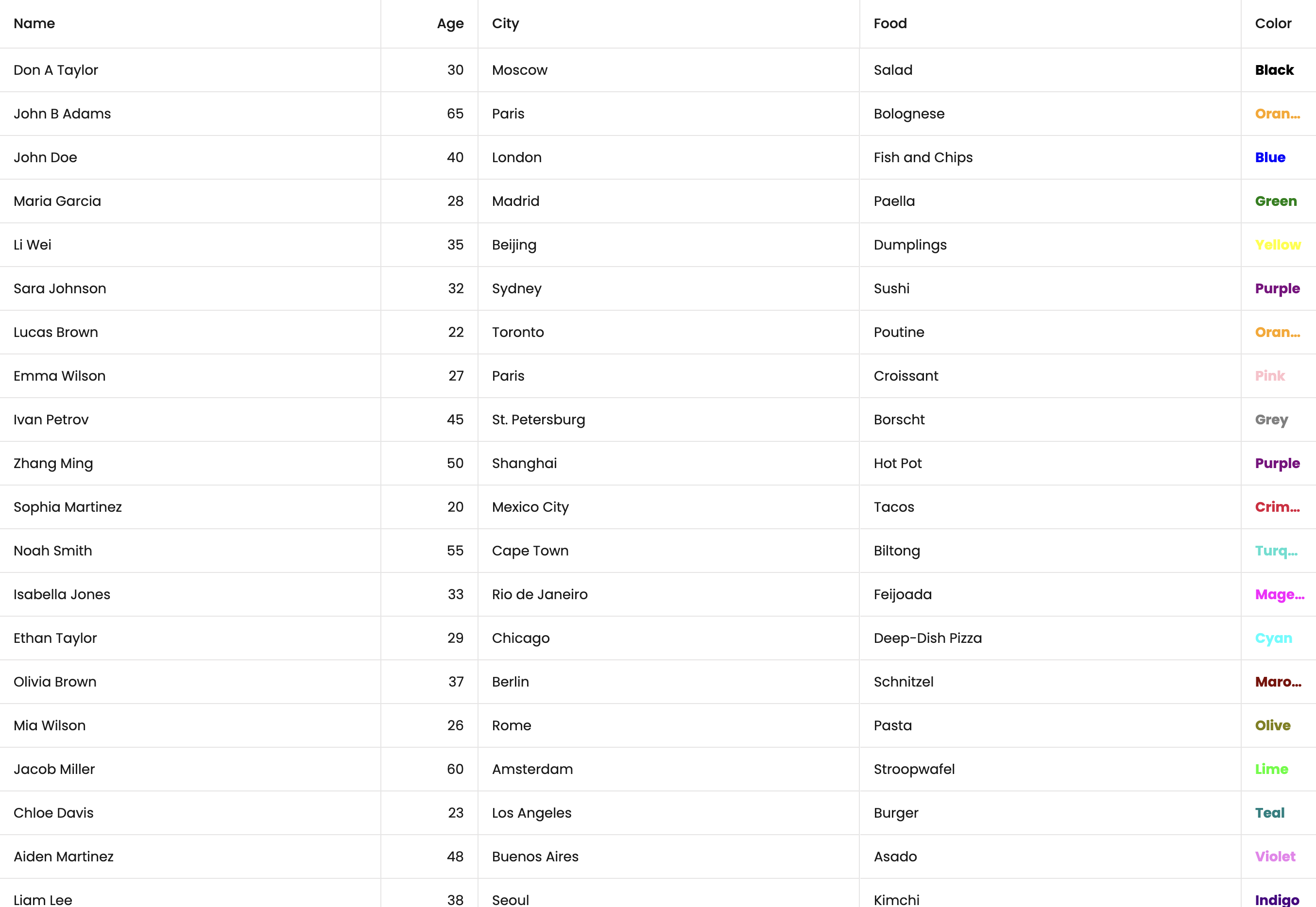
{ id : 1, name : 'Don A Taylor', age : 30, city : 'Moscow', food : 'Salad', color : 'Black' },
{ id : 2, name : 'John B Adams', age : 65, city : 'Paris', food : 'Bolognese', color : 'Orange' },
{ id : 3, name : 'John Doe', age : 40, city : 'London', food : 'Fish and Chips', color : 'Blue' },
{ id : 4, name : 'Maria Garcia', age : 28, city : 'Madrid', food : 'Paella', color : 'Green' },
{ id : 5, name : 'Li Wei', age : 35, city : 'Beijing', food : 'Dumplings', color : 'Yellow' },
{ id : 6, name : 'Sara Johnson', age : 32, city : 'Sydney', food : 'Sushi', color : 'Purple' },
{ id : 7, name : 'Lucas Brown', age : 22, city : 'Toronto', food : 'Poutine', color : 'Orange' },
{ id : 8, name : 'Emma Wilson', age : 27, city : 'Paris', food : 'Croissant', color : 'Pink' },
{ id : 9, name : 'Ivan Petrov', age : 45, city : 'St. Petersburg', food : 'Borscht', color : 'Grey' },
{ id : 10, name : 'Zhang Ming', age : 50, city : 'Shanghai', food : 'Hot Pot', color : 'Purple' },
{ id : 11, name : 'Sophia Martinez', age : 20, city : 'Mexico City', food : 'Tacos', color : 'Crimson' },
{ id : 12, name : 'Noah Smith', age : 55, city : 'Cape Town', food : 'Biltong', color : 'Turquoise' },
{ id : 13, name : 'Isabella Jones', age : 33, city : 'Rio de Janeiro', food : 'Feijoada', color : 'Magenta' },
{ id : 14, name : 'Ethan Taylor', age : 29, city : 'Chicago', food : 'Deep-Dish Pizza', color : 'Cyan' },
{ id : 15, name : 'Olivia Brown', age : 37, city : 'Berlin', food : 'Schnitzel', color : 'Maroon' },
{ id : 16, name : 'Mia Wilson', age : 26, city : 'Rome', food : 'Pasta', color : 'Olive' },
{ id : 17, name : 'Jacob Miller', age : 60, city : 'Amsterdam', food : 'Stroopwafel', color : 'Lime' },
{ id : 18, name : 'Chloe Davis', age : 23, city : 'Los Angeles', food : 'Burger', color : 'Teal' },
{ id : 19, name : 'Aiden Martinez', age : 48, city : 'Buenos Aires', food : 'Asado', color : 'Violet' },
{ id : 20, name : 'Liam Lee', age : 38, city : 'Seoul', food : 'Kimchi', color : 'Indigo' },
{ id : 21, name : 'Sophie Kim', age : 21, city : 'Tokyo', food : 'Ramen', color : 'Pink' },
{ id : 22, name : 'Alexander Nguyen', age : 41, city : 'Hanoi', food : 'Pho', color : 'Coral' },
{ id : 23, name : 'Ella Patel', age : 19, city : 'Mumbai', food : 'Curry', color : 'Amber' },
{ id : 24, name : 'James O Connor', age : 34, city : 'Dublin', food : 'Irish Stew', color : 'Green' },
{ id : 25, name : 'Isabelle Chen', age : 31, city : 'Hong Kong', food : 'Dim Sum', color : 'Brown' }
]
};
Next.js treats gridConfig.ts as a server module by default. Since functions cannot be passed from server modules to
Client Components due to serialization restrictions, any config containing functions (e.g., renderer) must be defined
or extended within the Client Component itself. Therefore, the columns definition should be moved to Grid.tsx to
ensure compatibility.
Create a file called Grid.tsx in the app/components/ folder. Add the following lines of code to it:
"use client";

import { BryntumGrid } from "@bryntum/grid-react";
import { useEffect, useRef, useState } from "react";

export default function Grid({ ...props }) {
    const [columns, _setColumns] = useState([
      { text : "Name", field : "name", flex: 2 },
      { text : "Age", field : "age", width: 100 },
      { text : "City", field : "city", flex: 1 },
      { text : "Food", field : "food", flex: 1 },
      {
        text     : "Color",
        field    : "color",
        flex     : 1,
        renderer : ({
          cellElement,
          value,
        } : {
          cellElement : HTMLElement;
          value       : string;
        }) => {
          // set the color based on the value (e.g. "Red" should be red)
          cellElement.style.color = value;
          return value;
        },
      },
    ]);
  const gridRef = useRef<BryntumGrid>(null);

  useEffect(() => {
    // Bryntum Grid instance
    const grid = gridRef?.current?.instance;
  }, []);

  return <BryntumGrid {...props} ref={gridRef} columns={columns}/>;
}
If you don't want to move the columns to Grid.tsx, remove the columns config from the above code and continue
following next steps. We will fix this later in GridWrapper.tsx.
The Grid component is a React
client component as it uses the
"use client" directive at the top of the file.
The code in the useEffect hook setup function shows you how to access the Bryntum Grid instance.
We need to create a wrapper component for the Bryntum Grid React component to render on the client only.
In the components folder, create a file called GridWrapper.tsx and add the following lines of code to it:
'use client';

import dynamic from "next/dynamic";
import { gridProps } from "../gridConfig";

const Grid = dynamic(() => import("./Grid"), {
  ssr: false,
  loading: () => {
    return (
      <div
        style={{
          display        : "flex",
          alignItems     : "center",
          justifyContent : "center",
          height         : "100vh",
        }}
      >
        <p>Loading...</p>
      </div>
    );
  },
});

const GridWrapper = () => {
    return <Grid {...gridProps} />
};
export { GridWrapper };
Make the GridWrapper.tsx a client component, if you haven't moved columns config to Grid.tsx.
The Bryntum Grid React component is
dynamically imported
with server-side rendering (ssr) set to false. This is done to prevent the Bryntum Grid React client component
from being pre-rendered on the server as Bryntum components are client-side only.
If the above throws an error, replace the ssr: false, with ssr: !!false,.
Next, replace the code in the app/page.tsx file with the following lines of code:
import { GridWrapper } from "@/app/components/GridWrapper";
/* FontAwesome is used for icons */
import "@bryntum/grid/fontawesome/css/fontawesome.css";
import "@bryntum/grid/fontawesome/css/solid.css";
/* Importing Grid's structural CSS and a theme */
import "@bryntum/grid/grid.css";
import "@bryntum/grid/svalbard-light.css";
import styles from "./page.module.css";

export default function Home() {
  return (
    <main className={styles.main}>
      <GridWrapper />
    </main>
  );
}
We imported the CSS styles for the Bryntum Grid Svalbard Light theme, which is one of five available themes.
Styling
To style the Bryntum Grid so that it takes up the whole page, replace the styles in the app/globals.css
file with the following styles:
body,
html {
  margin: 0;
  display: flex;
  flex-direction: column;
  height: 100vh;
  font-family: Poppins, "Open Sans", Helvetica, Arial, sans-serif;
  font-size: 14px;
}
Create src/app/page.module.css file with the following style for the <main> HTML tag:
.main {
  height: 100%;
}
If you want to customize the default theme, you can replace the stockholm.css with the sass version.
Visit Creating a custom theme section for more info.
You can learn more about styling your Bryntum Grid in our style guide.
Using ref outside Grid Component
To access the Bryntum Grid instance outside of Grid.tsx, you can use React’s useRef hook. Typically,
you would use forwardRef; however, in this case, the Grid component is lazy-loaded, so the ref needs to be
passed as a regular prop. To implement this, make the GridWrapper.tsx a client component, create a ref in the
GridWrapper function and pass it as a prop to the Grid:
"use client"; // make it a client component

import { useEffect, useRef } from "react";
import { BryntumGrid } from "@bryntum/grid-react";

const GridWrapper = () => {
  const gridRef = useRef<BryntumGrid>(null);

  useEffect(() => {
    // For testing purposes, since Grid is lazy loaded, gridRef is null initially
    setTimeout(() => {
      console.log(gridRef);
    }, 2000);
  });

  return <Grid gridRef={gridRef} {...gridProps} />;
};
In Grid.tsx, define the Props type:
type Props = {
  gridRef: React.Ref<BryntumGrid>;
} & BryntumGridProps;
Next, pass and apply the gridRef within the Grid function and remove any existing ref used for
BryntumGrid.
export default function Grid({ gridRef, ...props }: Props) {
  return (
    <BryntumGrid
      {...props}
      ref={gridRef}
      // additional config
    />
  );
}
Grid can now be accessed from Grid, letting you access Grid's events and configs.
Run the application
Run the local development server:
npm run dev
You'll see the Bryntum Grid app at the URL http://localhost:3000.