Replacing Font Awesome with Material Icons
Follow the steps below to replace the Font Awesome icons used by Bryntum products by default with Material Icons.
Difference between Font Awesome and Material Icons
Font Awesome
Font Awesome uses special unicode characters for every icon. For example the code icon (</>)
which in Font Awesome is represented by the f121 character. To use the icon in HTML two CSS classes are applied to a i element : fa and fa-code:
<i class="fa fa-code"></i>
fa has styles related to font configurations, like font-family, font-size, etc., and fa-code defines which icon using the
content property. In case of "code" icon content is "\f121".
Material Icons
Material Icons uses special words for every icon. These words are placed inside <i> tags. Material Icons
code icon is represented by the word "code".
To use the icon in HTML just one material-icons CSS class is used:
<i class="material-icons">code</i>
material-icons similar to fa has styles related to font configurations.
Using Font Awesome notation with Material Icons
According to the docs of content: "The content CSS property replaces an element with a generated value". That means both approaches will work with Material Icons:
<i class="material-icons">code</i>

<i class="material-icons">
    ::before // content : "code"
</i>
Use Material Icons in Bryntum products
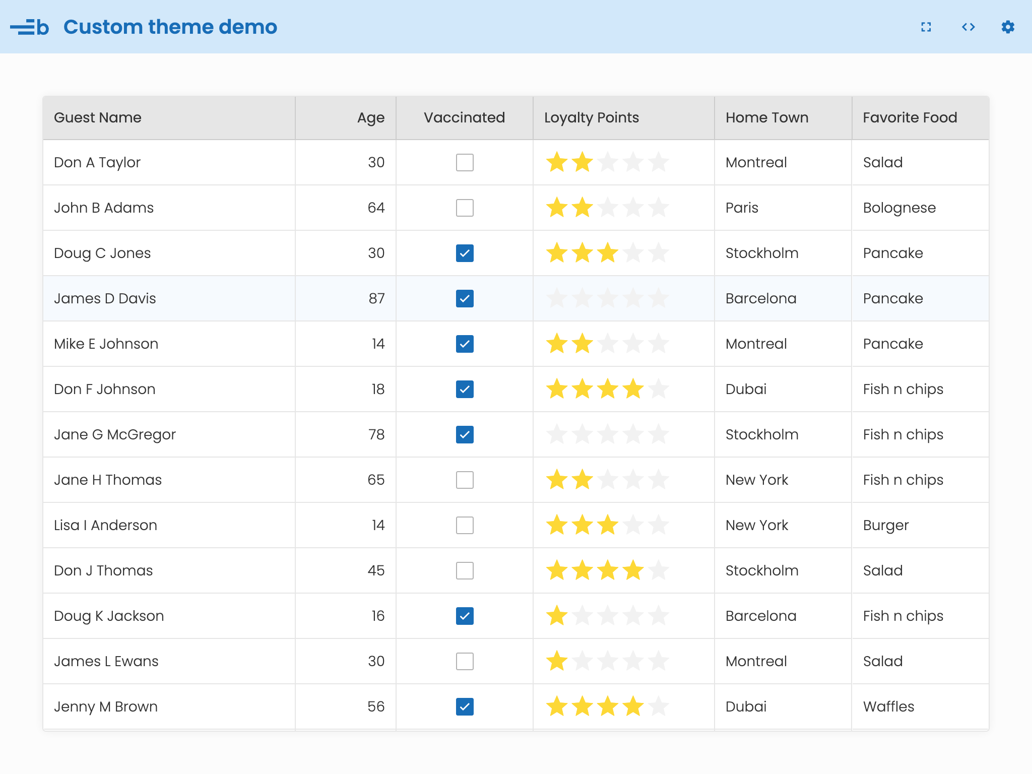
Below we will adopt the custom-theme demo (located in examples/custom-theme) to use Material Icons instead of Font
Awesome. Note that you can do the same for any demo, or your own application.
For simplicity, we will use Material Icons from Google Fonts. You can also download the icons and host them on your server (see their guide here for more details).
- Add the following link to the
<head>section of your HTML file:
<link href="https://fonts.googleapis.com/icon?family=Material+Icons" rel="stylesheet">
- Edit
custom-theme/resources/custom.css. Add the--b-widget-icon-font-familyvariable, pointing to the Material Icons font:
:root:not(.b-nothing) {
    --b-widget-icon-font-family : 'Material Icons';
}
Override built-in icons
All classes with "b-" prefix are Bryntum classes, i.e. b-grid, b-icon, etc. We use our own CSS classes to
encapsulate the font specification:
<i class="b-icon b-icon-code"></i>
To override the built-in icon, you have a couple of options:
- The content of the pseudo-element of each icon is backed by a CSS variable. You can override these variables in
your apps styling. For example, to override the "code" icon, you can set the
--b-icon-codevariable to "code":
:root:not(.b-nothing) {
   --b-widget-icon-font-family        : "Material Icons";

   /* Provide content for icons driven by CSS vars */
   --b-checkbox-checked-check-content : "check";

   /* Provide content for icons using b-icon-xx rules, see lib/Core/widget/Widget.css */
   --b-icon-code                      : "code";
   --b-icon-cog                       : "settings";
   --b-icon-star                      : "star";
}
- Or, you can override the content of each icon directly using the
b-icon-xx::beforerules. For example, to override the "code" icon, you can set the content of theb-icon-code::beforerule to "code":
:root:not(.b-nothing) {
   --b-widget-icon-font-family        : "Material Icons";

   /* Provide content for icons driven by CSS vars */
   --b-checkbox-checked-check-content : "check";
}

/* Provide content for icons using b-icon-xx rules, see lib/Core/widget/Widget.css */
.b-icon-code::before { content : "code"; }
.b-icon-cog::before { content : "settings"; }
.b-icon-star::before { content : "star"; }
/* and so on... */
Note that some widgets use separate CSS properties to define their icons. For example Checkbox uses
--b-checkbox-checked-check-content to specify icon to use for the checked state. You can find all these properties in
the widget's CSS file / documentation - or be inspecting the DOM using the browsers DevTools.
Checking out the result
Open the demo in a browser, and you will see something similar to the following: